Thursday, 3 May 2012
Thursday, 26 April 2012
Wednesday, 25 April 2012
Wednesday, 18 April 2012
Final logo ideas - My ideas
Top logo - Shop front
Middle logo - Smaller version to put on products such as sandwich labels.
Bottom logo - Main website logo, business card logo, flyer logo etc.
These designs will be put forward to the group and we will bring ideas together tomorrow :)!
Thursday, 12 April 2012
Timetable
This is a rough timetable of what tasks we plan on getting done by when. We have planned our project out over 7 weeks.
Colour schemes.
After having a discussion with our client, we have two potential colour schemes.
The client would like the above colour scheme as her main colours she has used in the business previously are green and brown. However, if the green seems to not work, or doesn't look right, she has given us a different colour to use instead.
In my opinion, the yellow is a lot more suitable to the business, as green just reminds me of mould. This isn't the best colour to use for a food business!
Bakery website research.
To gain some inspiration for my group's bakery website, I have had a look at some existing ones.

My group particularly like the style of this website. It is very appealing, not too complicated and looks quite modern.
My group like the full size background image on this website.
This website stood out to us as it is bold, clear and has used a nice background image.
Our client has specified that she wants green to be the main colour of the website. We felt as though this colour might not work but this website demonstrates it well.
Labels:
Client project,
DP3,
IMPS,
MM,
MTU,
Research,
Shirebrook Homebake,
Yr2
Monday, 2 April 2012
Brief for my group client project.
Group client project - Shirebrook Homebake
Brief:
Design and build a website to the client’s needs, which will be made live. Must be done in HTML5 and CSS3 and to W3C standards. The website will need to include some javascript/Jquery and will be integrated into WordPress.
Background info:
Shirebrook Homebake is a small family bakery based in Shirebrook, Nottinghamshire. The bakery has been open since 1980 and attracts a lot of customers from around the Mansfield area. A vast majority of the customers at the bakery are elderly, so usability needs to be taken into great consideration when designing the website. There is an existing logo and business card for the bakery.
Client requirements:
Produce a website in WordPress to allow them to add pictures/change content at their discretion.
Produce a product list with prices as a separate PDF to be downloadable.
Include a contact/enquirey form.
Use the logo on the front page
Follow the colour scheme on the business card (Green, white, black & brown).
Make the website as appealing & creative as possible, but don’t over complicate it because of the wide range of ages that would use the site.
Make the website appealing to other businesses for wholesale opportunities. Perhaps make this as a separate page with a link on the home page?
Pages to include:
Home
About
Images - Products, shop & bakery?
Product list with prices - As a page or downloadable PDF?
Location - Where to find us etc.
Contact
THIS WEBSITE IS TO BE COMPLETED & SUBMITTED BY FRIDAY JUNE 1ST 2012.
Friday, 30 March 2012
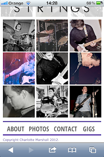
Mobile website - Screenshots for marking!
HOME PAGE
ABOUT PAGE
PHOTOS PAGE
CONTACT PAGE
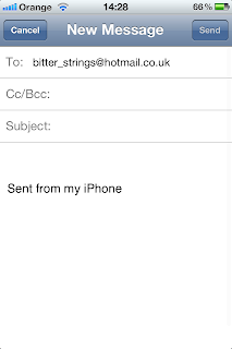
SEND EMAIL LINK - EFFECT
EMAIL APP OPENS AUTOMATICALLY.
Labels:
Bitter Strings,
client,
CSS,
DP3,
HTML,
IMPS,
MM,
Mobile design,
Mobilisation,
NTU,
stand alone,
Yr2
Thursday, 22 March 2012
Wednesday, 21 March 2012
Internet Explorer - Compatibility
When I looked at my website in IE, the only problem with it was that a border appeared around any image links such as my header, the links on the contact page and the icons in the footer. To sort this problem out, I have included a little css rule so that there are no borders around image links.
Labels:
Bitter Strings,
compatibility,
CSS,
DP3,
HTML,
IMPS,
internet explorer,
links,
MM,
NTU,
web design,
Wordpress,
Yr2
Screenshots of wordpress - Proof of my own design!
Just for marking purposes, I have taken some screenshots of my wordpress site for proof of my own design. I didn't want to use a template as the client was very particular with what they wanted.
Labels:
DP3,
IMPS,
MM,
Mobile design,
NTU,
web design,
Wordpress,
Yr2
Friday, 2 March 2012
Change of plannnnnn
So, I haven't blogged in over a week. Been incredibly busy sorting out the Bitter Strings desktop website. It's coming along really nicely. Had a couple of meetings with the lads and the desktop version of the website is almost complete!
The layout of the website has near enough stayed the same, but the design of it has completely turned on it's head. Here's some handsome lookin screenshots of the site as it is so far.
The layout of the website has near enough stayed the same, but the design of it has completely turned on it's head. Here's some handsome lookin screenshots of the site as it is so far.
Wednesday, 22 February 2012
Basic layout complete!
I'm really liking this website already. Think I've gotten the hang of modern design quite quickly. Especially the footer. Seems as though most websites have footers crammed with info, so I've followed the same principle but I don't want to overload it with little bits of information.
More to come on this project, but for the rest of today I will be concentrating on Wordpress! :)
More to come on this project, but for the rest of today I will be concentrating on Wordpress! :)
Labels:
Bitter Strings,
CSS,
DP3,
HTML,
IMPS,
MM,
Mobilisation,
NTU,
web design,
Yr2
Tuesday, 21 February 2012
Subscribe to:
Comments (Atom)


