Just finished a really simple animation. I made the word 'jelly' jump and move like jelly. I didn't find it too difficult, and I think I will highly enjoy this topic! My animation will be posted at a later date :)
Tuesday, 26 October 2010
Friday, 22 October 2010
Interactive space - Feedback on my project
On thursday (21.10.2010), our interactive space projects were shown to the whole group. Simon gave us some feedback on our work and so did the students. From my feedback I learnt that:
1) I need to make it easier for users to find certain things by making it more obvious, e.g. where the phone might be in each room.
2) One of my images is distorted - I need to make it right
3) It is frustrating how there are so many places to look and there is nothing to find.
I will improve my project by inserting some interactive arrows and question marks so that it is easier to navigate around. Using these symbols will make it easier for the user by making it easy to follow. Using a too big range of ways to navigate could confuse the user and make it difficult for them. I will alter the image that is distorted in order to make it look right and I need to try and include something else that the user will find but it isn't the right item. e.g. Could have lost something from a long time ago that they then find.
Hopefully this will make my project much better and I will finally get to finish it. Hurrah!
Pecha Kucha Presentation... You what?!
I still have no idea what this presentation is meant to be about. I don't know what Pecha Kucha is or how i'm meant to go around presenting my presentation!
I found this...
"PechaKucha 20x20 is a simple presentation format where you show 20 images, each for 20 seconds. The images forward automatically and you talk along to the images." - http://www.pecha-kucha.org/what
So basically, it isn't as hard as I thought it would be. But when we are told we cannot directly say what our design process is, that makes it that bit more difficult! I'm quite confused and I don't know if I will be able to do it properly... Ah well, i'll give it my best shot!
Wednesday, 20 October 2010
Developing my ideas - Interactive space project.
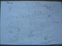
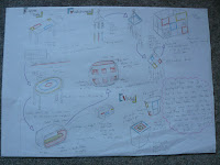
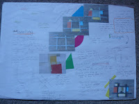
To get some ideas for my project I did a quick brainstorm to generate some ideas. I picked out an idea I liked best. I wanted to create some form of interactive story that involves looking for a lost object. I decided to have the object as a lost mobile phone and the character has lost it due to a 'mad' night out the night before. I thought this idea would tie in with students' uni life as afterall, we are all party animals! Here is a visual plan of what my interactive project will look like:
(click to view in full detail)
Multimedia, Art or Science?
In our seminar on the 12th of October we had the task to argue if Multimedia was an art or science. I found this quite an interesting debate because personally, I can't decide between the 2. Here are my reasons why.
"Multimedia is an Art rather than a Science"
Multimedia can be classed as a creative subject, this relates to art and design. It is also found within the art and design subject area so clearly it must be an art? Multimedia is a way of expression that invloves a lot of human input. If you take away this input, there is no creativity so surely there would be nothing left? Animation requires the ability to be able to draw characters and you need an 'artistic eye' for photography and film in order to get the perfect shot. In order for something to be a science, something has to be proven. Multimedia is purely based on opinion so it cannot possibly be a science.
"Multimedia is a Science rather than an Art"
The area of art is a very broad and opinionated topic. Due to it being so broad, people define different things as art so there is no definite view as to what art actually is. For example, recently the Turbine Hall at the Tate Modern art gallery has been filled with millions of small ceramic sunflower seeds. I personally do not class this as art due to it's simplicity and anyone is able to copy it. However, due to it being in the Tate Modern art gallery, some people obviously do class it as a 'work of art'. The scientific development of software and technology has allowed certain equipment to become more complexed and therefore has the ability to be multifunctional. For exapmple, Surface Mount Technology was developed in the 1960s, and went on to be widely used in the 1980s. This meant that electronic circuits could be made more intricate and take up less room. This would lead to the development of plasma tvs, plasma monitors, ipod touch, small computers, laptops and so on. With the electronic circuits now taking up less room, more can be added into the computer, camera, tv or whatever and make it have more memory, run faster and have the ability to do more than 1 thing at once. Without the development of software and technology, we wouldn't have the same equipment we use today in the world of Multimedia.
I have views for both sides, so I can't really say if it's an art or a science. What's your view?
My Multimedia
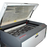 During my product design course in year 12, we did a series of mini projects. One of the projects was to create a clock for a subject area in the school. When it came to choosing materials for our final prototype, I decided to use Acrylic (polymethyl methacrylate). When it came to producing the body of the clock we had major problems making them look right. My school didn't have a very wide range of machinery to use in order to get a good finish on our clock bodies. One student that was on consortium from another school highlighted that their school owned a Laser Cutter. Immediately we jumped at the opportunity of using the software and equipment in order to make our clocks look professional.
 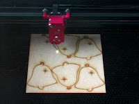 The laser cutter works by using x and y co ordinates and a high powered laser which the strength can be altered depening on the thinkness and type of materials being used. I had no idea such technology existed in schools until I saw this one. The design of the clock was produced on Techsoft 2D so that the colours of the outline could be changed. This would allow the laser cutter to identify which lines it needs to cut. I found the laser cutter surprisingly easy to use and was fascinated by how it worked. It took no time at all for it to cut out my clock and it did this with amazing precision and gave a really good overall finish. The amount of time me and the rest of my group spent trying to cut our clocks out using hand tools and band saws was ridiculous. This piece of technology really did make our lives a lot easier.
Thursday, 14 October 2010
HTML & CSS coding.. the basics!
I tried adding a link so you could see the site itself and interact with it, but I guess a screenshot will have to do.
Web page 1
Web page 2
Thursday, 7 October 2010
Wednesday, 6 October 2010
My Design Process
I would have written about my A2 Product Design project, but seeing as I do not have my coursework I have shown examples of my AS project and have provided a 3D model of my final logo for my A2 project and the final business card.
When it comes to generating ideas I always get stumped. I don’t know where to begin or what to start on. At the beginning of my AS product design project I started by having a client interview. This form of market research narrowed down the pathway I could take in order to come up with a design. Based upon the feedback I got, I went on to do a series of small quick sketches. Using this technique allowed me to generate a lot of ideas and they all flowed from each other. It is a fast way of generating a lot of ideas onto one page.
When developing ideas I believe it is essential to use as many techniques as possible in order to get a good perception on what the final design may be like. I would get client feedback from my generated ideas by asking them to select a small amount of sketches he/she likes. In my A2 product design project I developed my ideas by doing rough, quick mock ups on programmes such as Photoshop. This allowed me to change certain aspects of my ideas quickly, add colour effectively and I could send my ideas to my client electronically. I think that this is a great benefit as computers are being more widely used every single day within businesses.

Once I have my final idea from client feedback, I then go on to create prototypes of my product by using different techniques. I create a simple model out of simple materials so that it is a quick and easy process. This allows me to identify any problems with the design of the product and see how certain components can fit together. I would then use more complex materials so I can experiment with them to see what I could use in my final product. I have also created models on computer programmes such as Techsoft 2D and Pro Desktop. Pro desktop was particularly useful as it allowed me to create a 3D model of my final design. This was beneficial as it gave me a 3D visualisation of my final product, changes could be made easily and the final assembly is automatically changed when 1 component is altered. Yet again I could send my work to my client in order to get feedback.
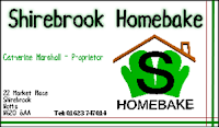

Throughout my design process I heavily rely on client feedback. This helps me to avoid bias and I can learn to create work to suit my client and their customers and not made upon my own expectations. Following these processes allowed me to be successful in Product Design and both my client and I were happy with the final outcome.
Screenshots of Techsoft 2D.
The image on the left shows some of the tools that are on the programme. I used the programme to create a net (right) for my point of sale in my A2 project and it was also used to create stickers to put onto my point of sale. The right image has different coloured lines because it codes for how it is cut out by a CADCAM machine. The red lines were scored and the black lines were cut. To create my stickers the same principle was used. A small CADCAM machine was used in order to cut them out. This made them look more professional and they had a better final finish.
Screenshots of Pro Desktop.
ProDesktop is a programme I used to create 3D electronic models of my work. This was another way of making prototypes. I was able to send my models to my client via e-mail and she sent me feedback to me via the internet. With businesses growing more to depend on the internet, this was a beneficial way of sending my work to my client.
Picture on the top shows an example of work that was done on ProDesktop. The picture on the bottom shows what the starting point is on the programme. The pictures below are examples of what I created for my final 3D logo.
Design Practice 1 - Visual Storyboard Sequences Task.
For our 'homework' we were set a task to create 3 sequences of 5 photos using different techniques. I chose to use different techniques in each one so I could show I can produce a variety of work. I know it's not the best, but at the end of the day I am here to learn!
Sequence 1 - Emptying Glass
Sequence 2 - Saturation
Sequence 3 - Progression - Making tea
I think i'm gonna enjoy doing this topic!
Tuesday, 5 October 2010
Design practice, practice
This was just a quick sequence we did during our first seminar. They were all clips from the film 'Vertigo'. We now have to create our own sequences using our own images. Our final piece for design practice 1 will be based on this style. I am looking forward to using my own images and seeing what results I get!
Subscribe to:
Comments (Atom)


