The band really like the simplicity of The Vaccines' website.... Just not as pink.
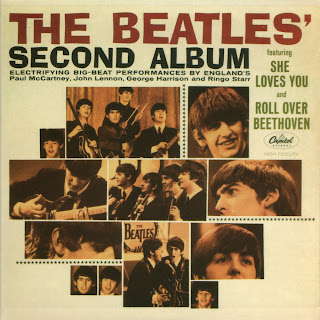
The band are strongly influenced by The Beatles. The washed out feel of this image reflects on how they like to edit their photos. It almost have an orangey warm feel to it. This sort of colour should be incorporated into the website.
Having a look at some possible fonts I could use. The colour scheme of this album cover fits in well with what they have specified.
Another good example of a 1960s album cover colour scheme that could work.
Bitter Strings' twitter page. I really like the opacity on the main div and the background image is visible through it. The background image in my opinion is too busy and needs to be toned down a lot to prevent the attention being driven away from the main content.


No comments:
Post a Comment