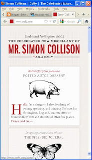
As the brief describes, our websites must be mobilised. In order to help me get to this stage, I need to look at how websites change when they go from a web state to a mobile state. It is important to not over crowd the mobile site, but still have the same detail as the desktop site. I have found 2 websites that I want to compare. The first is the portfolio website of Simon Collison.
This is the home page of the desktop version of his portfolio website. Simon's website is a good example of a responsive website. This means that when the page is minimized, it will respond by making it the right size to fit the resolution. This is shown by the next 2 images when the browser is minimized twice.
This particular display may be that of which would be displayed on a tablet computer/netbook. No information is taken out or replaced, it is simply just realigned to fit the width of the resolution.
This last image shows the display for possibly a mobile phone device. Again, no image or text is left out, it is all just realigned into the centre of the screen. This keeps the design consistent and easy to follow, but is there too much information on the one page? There is a big space left for users to scroll through which may become frustrating for them. For my website, I may want to consider how I lay my links & main information out.
Website number 2 is TGI Fridays.
TGIs is famously known for it's extrovert restaurants and over the top staff. it sets the perfect atmosphere for the restaurant'a "friday feeling". This is also reflected in their website, particularly the desktop version.
The home page of the website is pretty in your face. Graphics that surround the main DIV reflect on the many objects found pinned up on the walls of the restaurants. Clicking onto the "cocktails" link brings up a flash animated introduction to their cocktails.
The guy starts talking about the cocktails, and then gradually more and more stuff appears before it reveals the cocktails page. I can't decide if I like it or not, it does look really flashy and modern, but I just want to see the damn cocktails list! This is something I'll need to consider in my desktop website.
This is the cocktails "menu" navigation. It is flash animated and separates all of the types of cocktails. It's really nice to see navigation done in a different style, but it's something that will definitely not work on a mobile website.
Now to take a look at the mobile version...
The mobile version of the website is no where near as flashy as the desktop one. It could be said that it is pretty boring, nothing special about it. However, at the end of the day it is a mobile website! It does it's job. It's clean, simple & straight to the point. The main thing people want to know about a restaurant when on the go is food and where to find it! This is a good example of a practical mobile website!


No comments:
Post a Comment