
Showing posts with label Voyage. Show all posts
Showing posts with label Voyage. Show all posts
Thursday, 8 December 2011
Voyage Progress

Drawings for my website
These are just the graphics I am going to use to incorporate into my website.


Changes
After much debating over whether my website was good enough or absolute dogshite, I have completely changed my design. After talking to Shaun he explained to me that I should include some personality within my website. After all, this voyage is based on a personal journey, so I might as well reflect on things such as my memories and places I went to! To make it more personal I am thinking of including some hand drawn graphics. I think this will give it a really nice touch.
I am struggling with the javascript elements still, so i'm gonna try and concentrate on that :( Wish me luck!
I am struggling with the javascript elements still, so i'm gonna try and concentrate on that :( Wish me luck!
Voyage - Development

Finally have my wireframe sorted. Really struggling on what content to include! :(
Tuesday, 29 November 2011
Voyage - brainstorm
To help gain some inspiration as to what to do for my Voyage project, I did this brainstorm. Completely forgot about scanning it, so it's a tad late!


Voyage research - Cruise website review (thomas cook cruises)

The Thomas Cook cruise website seems to be made up of 2 main divs, with floating images & a separate header & footer. The colour scheme is very similar to the other 2 cruise websites I have already reviewed, so maybe I need to consider using the same sort of colour scheme for my website?

The navigation of all 3 websites have been pretty consistent. The navigation is situated at the top of the page and the offers are displayed directly below it to help draw attention to them. Rather than having a drop down menu from each link, all the links are set out which essentially makes it easier to find what users are looking for. This would prevent the users getting frustrated and make the website easily accessible.

The footer is slightly different to the other websites' as it doesn't contain as many links to different pages. This makes the website a lot more simple to use and prevents any confusion the user may encounter when trying to find something specific.
Voyage research - Cruise Website Reviews (Royal Caribbean)

The colour scheme is very similar to the P&O website, using a lot of blues & yellows that would be associated to the sea and sun.

The navigation situated at the top of the page involves a drop down menu just like the P&O website. The navigation is well set out, easy to follow and easy to read. This type of navigation seems popular so this may be something I need to incorporate into my website.

The footer shows all of the possible links for the website, and also contains some further information such as contact information & legal information. This small print can be very important, and I feel that it is not made clear enough on websites such as this one.
Unlike the P&O website, there is no social networking links. Social networks have become increasingly important with businesses. I may benefit from incorporating some form of social network link so this will be something to consider when I am adding content to my website.
Wednesday, 23 November 2011
Voyage research - Cruise Website Reviews (P&O)
To help me gain more inspiration for the design of my website, I have decided to analyse 3 existing cruise websites. These are P&O, Royal Caribbean and Thomas Cook.


The footer of the website contains a majority of the links that are within the navigation at the top of the page. There are also links to their facebook, twitter and youtube pages. I think these social networking links need to be made more prominent so that people can find them easier. Maybe add them to the top right corner of the page so people can see them as soon as they get onto the website?
On all of the pages also, there is a fixed DIV to allow users to give website feedback. I think this is a really good aspect of the website as they can make improvements to the website to make sure the usability of the website is up to standards.

This is the home page for P&O. I really like how the main container is centered in the middle of the screen with the blue gradient background behind it. Immediately I think of the sea when I see this type of background, so this could be something I could incorporate into my website. The image located at the top of the home page is really eye catching and contains an offer which would help to drive sales.

The links at the top of the page have a drop down menu which leads to different areas of the website. This is a good way of linking pages as it is very clear & people can easily find what they are looking for. To make it even quicker, a search bar is incorporated into the home page in the top right corner.
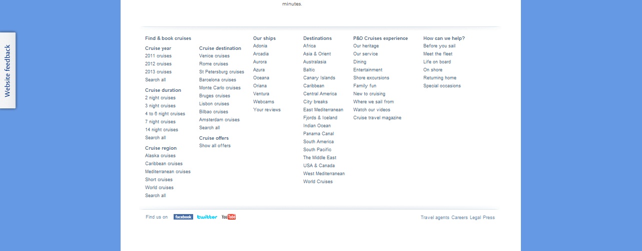
The footer of the website contains a majority of the links that are within the navigation at the top of the page. There are also links to their facebook, twitter and youtube pages. I think these social networking links need to be made more prominent so that people can find them easier. Maybe add them to the top right corner of the page so people can see them as soon as they get onto the website?
On all of the pages also, there is a fixed DIV to allow users to give website feedback. I think this is a really good aspect of the website as they can make improvements to the website to make sure the usability of the website is up to standards.
Tuesday, 22 November 2011
Moodboard for voyage
Because I am basing my voyage project on a cruise, I have decided to make a moodboard of cruise/holiday related things to help me gain inspiration.


What is Voyage?
Voyage is: "A long journey involving travel by sea or in space."
So how is this going to fit in with my project?
In July, I went on a cruise around the Italian Mediterranean. I thought this would be the perfect subject to base my voyage project on. I want to make it sort of educational, so that people can learn more about the culture, landmarks & traditions in each country.
So how is this going to fit in with my project?
In July, I went on a cruise around the Italian Mediterranean. I thought this would be the perfect subject to base my voyage project on. I want to make it sort of educational, so that people can learn more about the culture, landmarks & traditions in each country.
Friday, 28 October 2011
Colour schemes


So for my voyage website I've had an idea of basing it on my cruise I went on in July. Thinkin of making is educational so people can sail around the med visiting the places I went to & learn more about the country, culture & famous landmarks.
When I think of a cruise, I immediately think of the ocean, so greens & blues would be a pretty obvious colour scheme to use. However, I want to make it quite cartoony & animated so I'm thinking of creating some form of map, almost like a typical treasure hunt pirate map. The bottom colour scheme shows the main colours I would incorporate into this website design.
I need to do some more research into voyages and see if I really want to base it on the cruise I went on.
Subscribe to:
Posts (Atom)