Showing posts with label CSS. Show all posts

Friday, 30 March 2012

Wednesday, 21 March 2012

Internet Explorer - Compatibility

When I looked at my website in IE, the only problem with it was that a border appeared around any image links such as my header, the links on the contact page and the icons in the footer. To sort this problem out, I have included a little css rule so that there are no borders around image links.


Friday, 2 March 2012

Change of plannnnnn

So, I haven't blogged in over a week. Been incredibly busy sorting out the Bitter Strings desktop website. It's coming along really nicely. Had a couple of meetings with the lads and the desktop version of the website is almost complete!

The layout of the website has near enough stayed the same, but the design of it has completely turned on it's head. Here's some handsome lookin screenshots of the site as it is so far.


Wednesday, 22 February 2012

Basic layout complete!

I'm really liking this website already. Think I've gotten the hang of modern design quite quickly. Especially the footer. Seems as though most websites have footers crammed with info, so I've followed the same principle but I don't want to overload it with little bits of information.

More to come on this project, but for the rest of today I will be concentrating on Wordpress! :)

Tuesday, 21 February 2012

More examples of Wordpress websites.

Wordpress

I can't get Wordpress to work on my laptop for some reason, so I have decided to do some research into Wordpress websites and things I may want to use. 

Wordpress is a great tool for people to use if they want to add things to their websites after they have been built by a web designer. It is also a good tool to use to make a website as it is so flexible! Wordpress is becoming more and more popular and I feel it is important that I get a good understanding of it.

This website shows some really nice examples of websites that use Wordpess for much more than just a blog. Click here to view it.

After Thursdays seminar i'm going  to start making my own simple wordpress website. I really need to get into the swing of using it and become familiar with the interface.

Friday, 17 February 2012

Responsive websites.


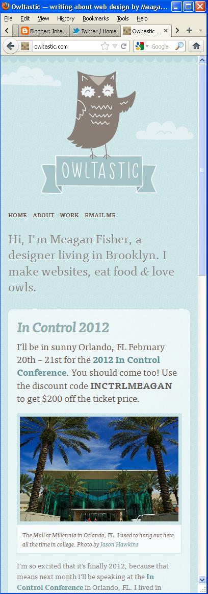
These websites show incredibly good examples of responsive design. I particularly like the Owltastic portfolio website. Looking at these websites, I need to identify key points to leave in my mobile website and what I could include in my desktop website to "jazz it up".

Colour schemes

I have been looking at some possible colour schemes.


The guys have specifically stated that they want a 1960s vintage theme, so I felt that these colours would suit their chosen theme best. I think that the last set of colours will be best to use. Not too much colour but one bold colour to give a bit of impact.


Wireframe development

I've been sketching some more wireframe ideas, both for desktop and the web. Here they are!


Next I am going to develop my wireframes more, then come up with some final ideas in photoshop.

Wireframe ideas

After having a sit down with the lads, we've come up with a few wireframes for me to work from.


Productive day at Proud Camden before their gig! :)
More to come soon.

Mobile Vs Web.

As the brief describes, our websites must be mobilised. In order to help me get to this stage, I need to look at how websites change when they go from a web state to a mobile state. It is important to not over crowd the mobile site, but still have the same detail as the desktop site. I have found 2 websites that I want to compare. The first is the portfolio website of Simon Collison.


This is the home page of the desktop version of his portfolio website. Simon's website is a good example of a responsive website. This means that when the page is minimized, it will respond by making it the right size to fit the resolution. This is shown by the next 2 images when the browser is minimized twice.

This particular display may be that of which would be displayed on a tablet computer/netbook. No information is taken out or replaced, it is simply just realigned to fit the width of the resolution.


This last image shows the display for possibly a mobile phone device. Again, no image or text is left out, it is all just realigned into the centre of the screen. This keeps the design consistent and easy to follow, but is there too much information on the one page? There is a big space left for users to scroll through which may become frustrating for them. For my website, I may want to consider how I lay my links & main information out.


Website number 2 is TGI Fridays.
TGIs is famously known for it's extrovert restaurants and over the top staff. it sets the perfect atmosphere for the restaurant'a "friday feeling". This is also reflected in their website, particularly the desktop version.


The home page of the website is pretty in your face. Graphics that surround the main DIV reflect on the many objects found pinned up on the walls of the restaurants.  Clicking onto the "cocktails" link brings up a flash animated introduction to their cocktails.


The guy starts talking about the cocktails, and then gradually more and more stuff appears before it reveals the cocktails page. I can't decide if I like it or not, it does look really flashy and modern, but I just want to see the damn cocktails list! This is something I'll need to consider in my desktop website.

This is the cocktails "menu" navigation. It is flash animated and separates all of the types of cocktails. It's really nice to see navigation done in a different style, but it's something that will definitely not work on a mobile website. 

Now to take a look at the mobile version...


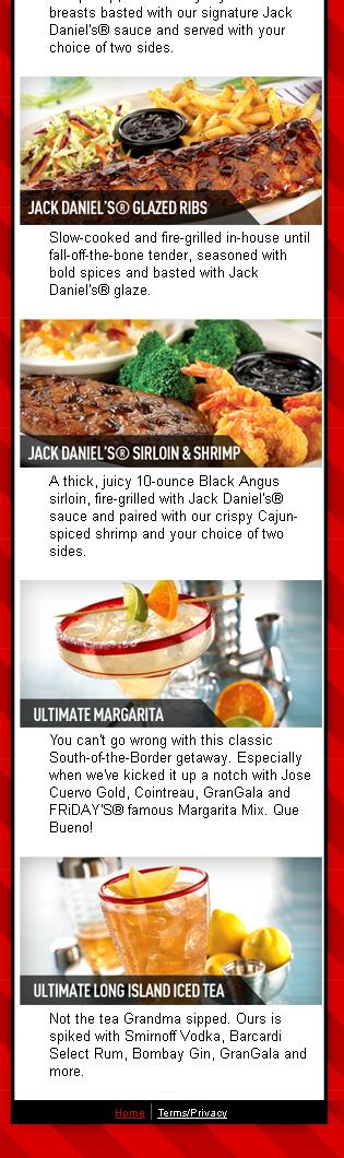
The mobile version of the website is no where near as flashy as the desktop one. It could be said that it is pretty boring, nothing special about it. However, at the end of the day it is a mobile website! It does it's job. It's clean, simple & straight to the point. The main thing people want to know about a restaurant when on the go is food and where to find it! This is a good example of a practical mobile website!


Friday, 3 February 2012

DP3 Assignment 2 - Design for Mobile.

Now that I have my artist for the current DP3 project, I have started some research into the sort of theme I should follow for their website. After a meeting with Bitter Strings, they identified some key points that they wanted to incorporate into the website.

1- Pages
  • Home page with a brief introduction.
  • About page with a brief introduction on the band as a whole, then individual information. 
  • Media page with their videos and photoshoot images.
  • Gig page with a list of their upcoming events.
  • Contact page with clear links to their social networking sites and a form to contact them.
2 - Colour scheme & theme
  • The band stressed that they want an old, vintage sort of feel but the website needs to be very simple. Not too over crowded with information or pictures and be straight to the point. 
  • Brown, cream and orange will be the main colours with orange being the colour used for impact.
  • Old paper style background would be well suited to their desired theme.
3- Some key components
  • Javascript image banner on the home page. This will be usde to grab attention & showcase some live gig photos.
  • 1960s theme.
4 - Inspiration
  • The band have identified that they really like the simplicity of The Vaccines website. This website can be found by clicking here
All of these points will be taken into consideration when designing the initial idea of my website. I do also need to take into account how the website is going to look when it is mobilised. My next task will be to look for some images for inspiration based on the specified theme and compare mobile & web interfaces.

Tuesday, 31 January 2012

Well on the way with my new portfolio!

My context 2 portfolio is coming along nicely! Main things I have included so far:

1- Javascript one page scrolling site! I have finally cracked the devil that is Javascript. Had a look at a few codes for the easing effect on a scrolling site. It wasn't working at first but I've got it to work! 

2- CSS3 transition navigation.

3- Colour scheme - Orange, peach & Grey. I chose these colours as orange is my favourite colour and I feel it best reflects myself. I have used a pastel orange & grey as pastel colours seem to be very current with websites at the moment. 

4- My 4 pages; Home, about, portfolio & contact. On my portfolio page I will be showcasing my web, graphic & other media works. 


When I produced my very first portfolio website during first year, I can remember my feedback being that my website didn't fit in with my moodboard. It was too corporate & didn't go together well because of my bird style logo. I have taken this into account and really toned my website down. I'm happy with the outcome so far and I'm going to be spending a lot of time on it!

Wednesday, 18 January 2012

Header trouble.


 With text or without? I'm pretty stuck. Also here you can see that i've included the valentines day promotion in the banner :) progress!

Friday, 9 December 2011

Footer research

After a long time debating over what to do with my footer, I have done some research into existing footers to help me design one for my voyage project. Footers can be a bit boring so I wanted to create something that looked interesting, but didn't draw too much attention away from the main content of the website. 

One footer I really like is one the website for Lambley Riding Club (click here to view). I really like how on each page the season changes & there are small additions to the scenery. The colours work well with the theme of the website and it adds that artistic touch to each page. 


Another footer I like is that on the website Thin Martian (click here to view). It's not too fancy but it gives a nice feel to the page, incorporating a couple of characters & adding some style to the footer. This seems likes the easiest option to go for considering how much time I have left, so I will probably make something similar to this :)


Thursday, 8 December 2011

Changes

After much debating over whether my website was good enough or absolute dogshite, I have completely changed my design. After talking to Shaun he explained to me that I should include some personality within my website. After all, this voyage is based on a personal journey, so I might as well reflect on things such as my memories and places I went to! To make it more personal I am thinking of including some hand drawn graphics. I think this will give it a really nice touch.

I am struggling with the javascript elements still, so i'm gonna try and concentrate on that :( Wish me luck!

Voyage - Development


Finally have my wireframe sorted. Really struggling on what content to include! :(

Thursday, 20 October 2011

Shorthand coding. (GL)

For Giselle's next seminar we've been asked to look at shorthand coding. Shorthand coding makes the CSS style sheet a lot easier to read & a lot shorter.


Colours
Hexadecimal colours consists of 6 letters or numbers that corresponds to a single colour. The 6 letters/numbers represent 3 colours, Red, Green and Blue. Each set of numbers/letters identifies how much of red, green or blue there is in a colour. If there are colours for example that are made up of 3 pairs or is 6 letters/numbers of the same then the colours can be shortened to just 3. For example:


#FFFFFF - white can become #FFF
#000000 - black can become #000
#FF0000 - red can become #F00

& so on & so fourth.


Margin & Padding
The code for margin & padding consists of 4 values that stands for the top, right, bottom & left. The values work in a clockwise order hence top, right, bottom then left. Rather than writing out something like :

margin-top: 1em ;
margin-right: 0em;
margin-bottom: 2em;
margin-left: 0.5em;


It can be replaced with:

margin: 1em 0 2em 0.5em;

The 0 doesn't need em after it because 0 is 0 and the em part will be ignored anyway! This is also the same principle when it comes to the padding.


Borders.
Borders can also be shortened to help make the css style sheet easier to read. Let's say for example the border has the following code:


border-width: 0.25em;
border-style: solid;
border-color: #FFFFFF

It can be shortened to:

border: 0.25em solid #FFF; (hexadecimal codes can be shortened remember!)


If you want to put a border around a set of text, to make the box you use the same principle as with the margin code. So it would be as follows:

border-width:1em 2em 3em 4em;


Backgrounds
Codes for backgrounds tend to get quite long winded. So if your code for your background looks like this:


background-color:#f00;
background-image:url(background.gif);
background-repeat:no-repeat;
background-attachment:fixed;
background-position:0 0;


It can be shortened to this:


background:#f00 url(background.gif) no-repeat fixed 0 0;


Fonts
From looking at the codes above, it seems as though they all follow the same pattern. Font codes can be shortened too.


font-style:italic;
font-variant:small-caps;
font-weight:bold;
font-size:1em;
line-height:140%;
font-family:"Lucida Grande",sans-serif;


shortened to:

font:italic small-caps bold 1em/140% "Lucida Grande",sans-serif;

Thursday, 3 February 2011

Portfolio layout update.

After spending 3 hours trying to perfect my layout for my portfolio, I think I have finally cracked it!
And to make it even better, Shaun said he liked my design :D Yay!

Thursday, 14 October 2010

HTML & CSS coding.. the basics!

I tried adding a link so you could see the site itself and interact with it, but I guess a screenshot will have to do.

Web page 1

Web page 2