Showing posts with label Mobilisation. Show all posts

Friday, 30 March 2012

Wednesday, 22 February 2012

Basic layout complete!

I'm really liking this website already. Think I've gotten the hang of modern design quite quickly. Especially the footer. Seems as though most websites have footers crammed with info, so I've followed the same principle but I don't want to overload it with little bits of information.

More to come on this project, but for the rest of today I will be concentrating on Wordpress! :)

Tuesday, 21 February 2012

Started the Bitter Strings mobilised website!

Here's a print screen of the banner & the layout of all the divs. 

NOTE: The colours of the divs won't be this colour!


Friday, 17 February 2012

Wireframe ideas

After having a sit down with the lads, we've come up with a few wireframes for me to work from.


Productive day at Proud Camden before their gig! :)
More to come soon.

Mobile Vs Web.

As the brief describes, our websites must be mobilised. In order to help me get to this stage, I need to look at how websites change when they go from a web state to a mobile state. It is important to not over crowd the mobile site, but still have the same detail as the desktop site. I have found 2 websites that I want to compare. The first is the portfolio website of Simon Collison.


This is the home page of the desktop version of his portfolio website. Simon's website is a good example of a responsive website. This means that when the page is minimized, it will respond by making it the right size to fit the resolution. This is shown by the next 2 images when the browser is minimized twice.

This particular display may be that of which would be displayed on a tablet computer/netbook. No information is taken out or replaced, it is simply just realigned to fit the width of the resolution.


This last image shows the display for possibly a mobile phone device. Again, no image or text is left out, it is all just realigned into the centre of the screen. This keeps the design consistent and easy to follow, but is there too much information on the one page? There is a big space left for users to scroll through which may become frustrating for them. For my website, I may want to consider how I lay my links & main information out.


Website number 2 is TGI Fridays.
TGIs is famously known for it's extrovert restaurants and over the top staff. it sets the perfect atmosphere for the restaurant'a "friday feeling". This is also reflected in their website, particularly the desktop version.


The home page of the website is pretty in your face. Graphics that surround the main DIV reflect on the many objects found pinned up on the walls of the restaurants.  Clicking onto the "cocktails" link brings up a flash animated introduction to their cocktails.


The guy starts talking about the cocktails, and then gradually more and more stuff appears before it reveals the cocktails page. I can't decide if I like it or not, it does look really flashy and modern, but I just want to see the damn cocktails list! This is something I'll need to consider in my desktop website.

This is the cocktails "menu" navigation. It is flash animated and separates all of the types of cocktails. It's really nice to see navigation done in a different style, but it's something that will definitely not work on a mobile website. 

Now to take a look at the mobile version...


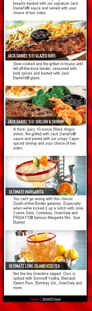
The mobile version of the website is no where near as flashy as the desktop one. It could be said that it is pretty boring, nothing special about it. However, at the end of the day it is a mobile website! It does it's job. It's clean, simple & straight to the point. The main thing people want to know about a restaurant when on the go is food and where to find it! This is a good example of a practical mobile website!


Friday, 3 February 2012

DP3 - Inspiration images

The band really like the simplicity of The Vaccines' website.... Just not as pink.

The band are strongly influenced by The Beatles. The washed out feel of this image reflects on how they like to edit their photos. It almost have an orangey warm feel to it. This sort of colour should be incorporated into the website.

Having a look at some possible fonts I could use. The colour scheme of this album cover fits in well with what they have specified.

 Another good example of a 1960s album cover colour scheme that could work.

Bitter Strings' twitter page. I really like the opacity on the main div and the background image is visible through it. The background image in my opinion is too busy and needs to be toned down a lot to prevent the attention being driven away from the main content.

DP3 Assignment 2 - Design for Mobile.

Now that I have my artist for the current DP3 project, I have started some research into the sort of theme I should follow for their website. After a meeting with Bitter Strings, they identified some key points that they wanted to incorporate into the website.

1- Pages
  • Home page with a brief introduction.
  • About page with a brief introduction on the band as a whole, then individual information. 
  • Media page with their videos and photoshoot images.
  • Gig page with a list of their upcoming events.
  • Contact page with clear links to their social networking sites and a form to contact them.
2 - Colour scheme & theme
  • The band stressed that they want an old, vintage sort of feel but the website needs to be very simple. Not too over crowded with information or pictures and be straight to the point. 
  • Brown, cream and orange will be the main colours with orange being the colour used for impact.
  • Old paper style background would be well suited to their desired theme.
3- Some key components
  • Javascript image banner on the home page. This will be usde to grab attention & showcase some live gig photos.
  • 1960s theme.
4 - Inspiration
  • The band have identified that they really like the simplicity of The Vaccines website. This website can be found by clicking here
All of these points will be taken into consideration when designing the initial idea of my website. I do also need to take into account how the website is going to look when it is mobilised. My next task will be to look for some images for inspiration based on the specified theme and compare mobile & web interfaces.