
Showing posts with label web design. Show all posts
Showing posts with label web design. Show all posts
Thursday, 3 May 2012


Wednesday, 25 April 2012
Final logo
Here is the finalised logo! I've had to tweak a couple of things in order to get it right.

Wednesday, 18 April 2012
Final logo ideas - My ideas

Top logo - Shop front
Middle logo - Smaller version to put on products such as sandwich labels.
Bottom logo - Main website logo, business card logo, flyer logo etc.
These designs will be put forward to the group and we will bring ideas together tomorrow :)!
Thursday, 12 April 2012
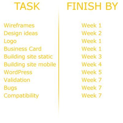
Timetable
This is a rough timetable of what tasks we plan on getting done by when. We have planned our project out over 7 weeks.
Colour schemes.
After having a discussion with our client, we have two potential colour schemes.

The client would like the above colour scheme as her main colours she has used in the business previously are green and brown. However, if the green seems to not work, or doesn't look right, she has given us a different colour to use instead.

In my opinion, the yellow is a lot more suitable to the business, as green just reminds me of mould. This isn't the best colour to use for a food business!
Monday, 2 April 2012
Brief for my group client project.
Group client project - Shirebrook Homebake
Brief:
Design and build a website to the client’s needs, which will be made live. Must be done in HTML5 and CSS3 and to W3C standards. The website will need to include some javascript/Jquery and will be integrated into WordPress.
Background info:
Shirebrook Homebake is a small family bakery based in Shirebrook, Nottinghamshire. The bakery has been open since 1980 and attracts a lot of customers from around the Mansfield area. A vast majority of the customers at the bakery are elderly, so usability needs to be taken into great consideration when designing the website. There is an existing logo and business card for the bakery.
Client requirements:
Produce a website in WordPress to allow them to add pictures/change content at their discretion.
Produce a product list with prices as a separate PDF to be downloadable.
Include a contact/enquirey form.
Use the logo on the front page
Follow the colour scheme on the business card (Green, white, black & brown).
Make the website as appealing & creative as possible, but don’t over complicate it because of the wide range of ages that would use the site.
Make the website appealing to other businesses for wholesale opportunities. Perhaps make this as a separate page with a link on the home page?
Pages to include:
Home
About
Images - Products, shop & bakery?
Product list with prices - As a page or downloadable PDF?
Location - Where to find us etc.
Contact
THIS WEBSITE IS TO BE COMPLETED & SUBMITTED BY FRIDAY JUNE 1ST 2012.
Brief:
Design and build a website to the client’s needs, which will be made live. Must be done in HTML5 and CSS3 and to W3C standards. The website will need to include some javascript/Jquery and will be integrated into WordPress.
Background info:
Shirebrook Homebake is a small family bakery based in Shirebrook, Nottinghamshire. The bakery has been open since 1980 and attracts a lot of customers from around the Mansfield area. A vast majority of the customers at the bakery are elderly, so usability needs to be taken into great consideration when designing the website. There is an existing logo and business card for the bakery.
Client requirements:
Produce a website in WordPress to allow them to add pictures/change content at their discretion.
Produce a product list with prices as a separate PDF to be downloadable.
Include a contact/enquirey form.
Use the logo on the front page
Follow the colour scheme on the business card (Green, white, black & brown).
Make the website as appealing & creative as possible, but don’t over complicate it because of the wide range of ages that would use the site.
Make the website appealing to other businesses for wholesale opportunities. Perhaps make this as a separate page with a link on the home page?
Pages to include:
Home
About
Images - Products, shop & bakery?
Product list with prices - As a page or downloadable PDF?
Location - Where to find us etc.
Contact
THIS WEBSITE IS TO BE COMPLETED & SUBMITTED BY FRIDAY JUNE 1ST 2012.
Thursday, 22 March 2012
Website test - iPhone and iPad
Here are some screenshots of my website on an iPhone and iPad
IPHONE IMAGES


IPAD IMAGES


Wednesday, 21 March 2012
Internet Explorer - Compatibility
When I looked at my website in IE, the only problem with it was that a border appeared around any image links such as my header, the links on the contact page and the icons in the footer. To sort this problem out, I have included a little css rule so that there are no borders around image links.


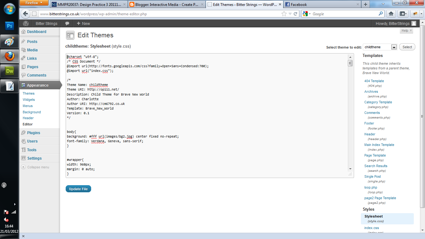
Screenshots of wordpress - Proof of my own design!
Just for marking purposes, I have taken some screenshots of my wordpress site for proof of my own design. I didn't want to use a template as the client was very particular with what they wanted.


Friday, 2 March 2012
Change of plannnnnn
So, I haven't blogged in over a week. Been incredibly busy sorting out the Bitter Strings desktop website. It's coming along really nicely. Had a couple of meetings with the lads and the desktop version of the website is almost complete!
The layout of the website has near enough stayed the same, but the design of it has completely turned on it's head. Here's some handsome lookin screenshots of the site as it is so far.


The layout of the website has near enough stayed the same, but the design of it has completely turned on it's head. Here's some handsome lookin screenshots of the site as it is so far.


Wednesday, 22 February 2012
Basic layout complete!

More to come on this project, but for the rest of today I will be concentrating on Wordpress! :)
Tuesday, 21 February 2012
Started the Bitter Strings mobilised website!
Here's a print screen of the banner & the layout of all the divs.
NOTE: The colours of the divs won't be this colour!

Monday, 20 February 2012
Wireframes galore!
I've done some more wireframes for desktop on photoshop, here's what i've come up with! Only a rough idea but it gives me something to work from.


Friday, 17 February 2012
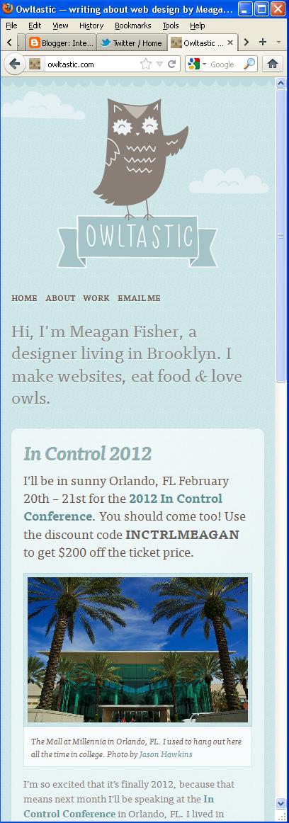
Responsive websites.


Friday, 3 February 2012
DP3 - Inspiration images

The band really like the simplicity of The Vaccines' website.... Just not as pink.

The band are strongly influenced by The Beatles. The washed out feel of this image reflects on how they like to edit their photos. It almost have an orangey warm feel to it. This sort of colour should be incorporated into the website.

Having a look at some possible fonts I could use. The colour scheme of this album cover fits in well with what they have specified.

Another good example of a 1960s album cover colour scheme that could work.

Bitter Strings' twitter page. I really like the opacity on the main div and the background image is visible through it. The background image in my opinion is too busy and needs to be toned down a lot to prevent the attention being driven away from the main content.
DP3 Assignment 2 - Design for Mobile.
Now that I have my artist for the current DP3 project, I have started some research into the sort of theme I should follow for their website. After a meeting with Bitter Strings, they identified some key points that they wanted to incorporate into the website.
1- Pages
- Home page with a brief introduction.
- About page with a brief introduction on the band as a whole, then individual information.
- Media page with their videos and photoshoot images.
- Gig page with a list of their upcoming events.
- Contact page with clear links to their social networking sites and a form to contact them.
2 - Colour scheme & theme
- The band stressed that they want an old, vintage sort of feel but the website needs to be very simple. Not too over crowded with information or pictures and be straight to the point.
- Brown, cream and orange will be the main colours with orange being the colour used for impact.
- Old paper style background would be well suited to their desired theme.
3- Some key components
- Javascript image banner on the home page. This will be usde to grab attention & showcase some live gig photos.
- 1960s theme.
4 - Inspiration
- The band have identified that they really like the simplicity of The Vaccines website. This website can be found by clicking here
All of these points will be taken into consideration when designing the initial idea of my website. I do also need to take into account how the website is going to look when it is mobilised. My next task will be to look for some images for inspiration based on the specified theme and compare mobile & web interfaces.
Wednesday, 1 February 2012
Sneaky peek of my portfolio.
Pictures are not finalised yet, i'm just trying to get the coding sorted! Still a looooong way to go.
All 3 columns are floated divs, so this project is a really good way of practicing floating divs and getting into the swing of it.
All 3 columns are floated divs, so this project is a really good way of practicing floating divs and getting into the swing of it.

Tuesday, 31 January 2012
Well on the way with my new portfolio!
My context 2 portfolio is coming along nicely! Main things I have included so far:
1- Javascript one page scrolling site! I have finally cracked the devil that is Javascript. Had a look at a few codes for the easing effect on a scrolling site. It wasn't working at first but I've got it to work!
2- CSS3 transition navigation.
3- Colour scheme - Orange, peach & Grey. I chose these colours as orange is my favourite colour and I feel it best reflects myself. I have used a pastel orange & grey as pastel colours seem to be very current with websites at the moment.
4- My 4 pages; Home, about, portfolio & contact. On my portfolio page I will be showcasing my web, graphic & other media works.
When I produced my very first portfolio website during first year, I can remember my feedback being that my website didn't fit in with my moodboard. It was too corporate & didn't go together well because of my bird style logo. I have taken this into account and really toned my website down. I'm happy with the outcome so far and I'm going to be spending a lot of time on it!
Monday, 30 January 2012
Another web design client. - Cupcake Creations by Becky.
Becky Wilkinson is my newest client. She runs her own cupcake business off of facebook and is very popular within her local community. Even though she gets a lot of business through facebook, people who are not part of her page would not know about her and therefore may be losing out on crucial sales. She produces a wide range of cupcakes, from vanilla to baileys, chocolate to Guinness, she has the lot! Even gluten free, dairy free & egg free cakes! All made with free range & fairtrade products (where possible) and of course, some TLC.
I have a little meeting with her on feb 13th to discuss key elements for her website and to collect my valentines day cupcakes! :D
Her current website is in desperate need of an update, in order to suit her business & include some up to date designs & offers.
Her current website can be found by clicking here
Her facebook page can be found by clicking here
Visit if you dare, you will just want to buy the lot!
Her current website is in desperate need of an update, in order to suit her business & include some up to date designs & offers.
Her current website can be found by clicking here
Her facebook page can be found by clicking here
Visit if you dare, you will just want to buy the lot!


Subscribe to:
Posts (Atom)