Showing posts with label review. Show all posts

Friday, 17 February 2012

Mobile Vs Web.

As the brief describes, our websites must be mobilised. In order to help me get to this stage, I need to look at how websites change when they go from a web state to a mobile state. It is important to not over crowd the mobile site, but still have the same detail as the desktop site. I have found 2 websites that I want to compare. The first is the portfolio website of Simon Collison.


This is the home page of the desktop version of his portfolio website. Simon's website is a good example of a responsive website. This means that when the page is minimized, it will respond by making it the right size to fit the resolution. This is shown by the next 2 images when the browser is minimized twice.

This particular display may be that of which would be displayed on a tablet computer/netbook. No information is taken out or replaced, it is simply just realigned to fit the width of the resolution.


This last image shows the display for possibly a mobile phone device. Again, no image or text is left out, it is all just realigned into the centre of the screen. This keeps the design consistent and easy to follow, but is there too much information on the one page? There is a big space left for users to scroll through which may become frustrating for them. For my website, I may want to consider how I lay my links & main information out.


Website number 2 is TGI Fridays.
TGIs is famously known for it's extrovert restaurants and over the top staff. it sets the perfect atmosphere for the restaurant'a "friday feeling". This is also reflected in their website, particularly the desktop version.


The home page of the website is pretty in your face. Graphics that surround the main DIV reflect on the many objects found pinned up on the walls of the restaurants.  Clicking onto the "cocktails" link brings up a flash animated introduction to their cocktails.


The guy starts talking about the cocktails, and then gradually more and more stuff appears before it reveals the cocktails page. I can't decide if I like it or not, it does look really flashy and modern, but I just want to see the damn cocktails list! This is something I'll need to consider in my desktop website.

This is the cocktails "menu" navigation. It is flash animated and separates all of the types of cocktails. It's really nice to see navigation done in a different style, but it's something that will definitely not work on a mobile website. 

Now to take a look at the mobile version...


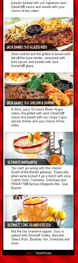
The mobile version of the website is no where near as flashy as the desktop one. It could be said that it is pretty boring, nothing special about it. However, at the end of the day it is a mobile website! It does it's job. It's clean, simple & straight to the point. The main thing people want to know about a restaurant when on the go is food and where to find it! This is a good example of a practical mobile website!


Tuesday, 1 November 2011

Weekly website review - Week 4

Website of the day for the 1st November 2011 - The Google Puzzle


FINALLY SOMETHING IN HTML5! :D


This was a chrome experiment with HTML5, which was very similar to the HTML music video "The Wilderness Downtown" featuring Arcade Fire's single "We Used To Wait". 


The concept of the game is that Google has lost one of it's letter o's and you have to complete the game to get it back. I really love the way each of the windows are set out and how the game is displayed.


It's easy to use, has clear instructions and even saves your progress! I think this is a really nice experiment with HTML5 and I hope google plan on doing more with it!


Wednesday, 26 October 2011

Weekly website review - Week 3

Today, The FWA's website of the day is ALDO, a shoe brand. This website isn't the company's main selling website, it's more of a promotional website which I find quite confusing. 


And yet again, we have ANOTHER website that is Flash operated. The amount of times I've seen that HTML 5 and CSS 3 is taking over is starting to seem a bit silly. It seems as though people can't move away from Flash! There's not a lot wrong with it, but the website did take a while to load because of it being flash. Honestly, think people should look into HTML 5 more!


Okay, so the whole idea of the website is to try and promote some sort of offer. There are 3 games based around the products and if you win every game you get 15% off your next purchase. Just by playing you can get entered into a prize draw for a life time's supply of shoes.


I think it's a really quirky way of trying to promote the offers, but not everyone will know about the site so it is essential they advertise it on their main website, in stores, flyers etc. 


There is a link in the top right hand corner of the screen so that when you click on it you can just view the range of shoes available. I think this isn't very practical because they then have to find another website, find the same pair of shoes and then buy them if they want to. I think the link to view the collection should be replaced with a link to the main website.


This is a screenshot of one of the games. I think it's a really nice way of seeing what's available from them and the experience is totally interactive. 


Even thought the website is meant to be interactive & all that, there isn't really a lot to be interactive with. You click on a few things to pick them and then everything is done by flash. It gets a bit boring as you go further on so it may lose people's interest.


I like how the links are all positioned along the bottom, keeping them close together & easy to find. However at times, I think it is a bit hard to read them. I have no idea what relevance the white tiger has to the brand, so I just think it's a bit weird. This website gets 7/10 :)

Friday, 7 October 2011

DP3 Seminar work (DD) (SB)

For our seminar with David & Shaun we were asked to do a task. For David to review a website & for Shaun to find 3 interactive medias that we liked. So this post is gonna kill 2 birds with 1 stone.

Interactive 1 - BooBahs children's website

This website is an interactive entertainment website for pre-schoolers based on the BooBahs TV programme. The age range that the programme normally is aimed at is 3 - 5 years old. What is particularly good about this website is that there is no text at all. This makes it easy for children to use as they can't read at all or can read very little.

Every aspect of the website is interactive, full of different sounds, movements & activities to do. Everywhere you click it leads to a different page with something different to do. The fact that it is so diverse and has all of these interactive components helps to keep the children entertained. The use of bold, bright colours also adds to this effect.


The above image is the home page. As the cursor rolls over different components, different sounds can be heard and different animations occur. The coloured spots at the top of the page all lead to different pages with different activities to do. This also goes for the characters & the present in the centre of the page. 


The image above is an example of one of the activities available for children to do. Even though the website looks like it's been made by a bunch of fairies on crack, i'll definitely give it 10/10 for practicality!


Interactive 2 - Plants vs Zombies Application
Plants vs. Zombies is a tower defense action video game developed and originally published by PopCap Games for Microsoft Windows and Mac OS X. The game involves a homeowner using many varieties of plants to repel an army of zombies from "eating their brains". I have this application on my iPhone and I can honestly say it's a guilty pleasure. I love the range of different characters involved & that each level is set in different environments. Not only is there the main game, there is also a series of mini games that incorporates the same characters. A new aspect to the game is the Zen Garden, where you can grow your own plants & sell them in order to make money faster to buy new plants/tools. 


The App itself is very easy to use. You get a tutorial in how to play the game when you first play it and the same goes for the mini games. I have spent many hours on this game & I can say it is definitely one of the most entertaining! 


Thanks to this little gem of a game, I now know how to survive a zombie apocalypse. I'm just hoping plants evolve on time!


Interactive 3 - Mauricio Studio
This is the online portfolio for Web Designer & Illustrator Mauricio Guimaraes. I love how he incorporates both of his practices into one webstie. As soon as you go onto his website, you can immediately see what he is capable of. Even though it has been built in flash and can sometimes take a while to load, I think it is a well thought out creative website. You can navigate around the "map" to find the different parts of his site. If you have difficulty finding things then there are links at the bottom of the screen. The theme, style & colour scheme is kept throughout the website & the text is legible. I think the text could do with being a little bit bigger & the navigation around the map is a bit slow. All in all, it helps to express what Mauricio is all about & is a good way to present a work portfolio.